

Here at the Environmental Finance Center we work with a lot of data, but all the data in the world is useless if you can’t convey the story of the data to people who need to understand it. In line with our mission to support informed financial decision-making, we produce Utility Financial Sustainability and Rates Dashboards and Excel-based tools to help local governments and stakeholders visually decode complex data. Since I joined the EFC last year as a Data Specialist & Project Manager, I’m happy to say that it is my job to make sure that the visualizations we produce get the message across as efficiently and accurately as possible. Based on my experience I’ve put together some tips on how to give your charts a makeover to give your viewers the biggest impact.
However, you don’t have to be a data nerd to benefit from these makeover guidelines (although, welcome to the club if you are!). Anyone can use the following tips for more effective visualizations, whether you’re presenting at a board meeting or reviewing your own personal budget.
To illustrate some key visualization principles, I’ll guide you through the changes I applied to a visualization for one of our tools, the Water & Wastewater Residential Rates Affordability Assessment Tool.
Choose the right chart
This critical first step involves examining the types of data that you are working with. What kind of data is it (categorical, temporal, spatial, continuous?) and what does it lend itself to? Are you looking at changes over time (line graph)? Are differences in volume important (bar chart)? Do you want to apply a variable to a geographic area (heat map)? If you’re stuck on how to present your data, the team at Evergreen Data made a helpful chart chooser with examples of different kinds of charts and what they are best used for.
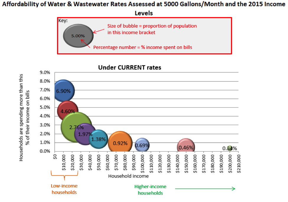
In the example of our Affordability Assessment Tool, the goal was to show the overall population spread, as well as the percentage that each population segment was spending on water & wastewater bills as a proportion of their annual income. See what a jumble that is to read? Data visualizations should allow you to cut through confusion to clearly see trends, notable points, and comparisons. Below is the old version of the chart, which took some head scratching to understand.
I’ll go more into why and how I made over this chart in the next points.
Use your brain to your advantage
Studies in human cognition have determined that certain kinds of stimuli are more quickly processed as “pre-attentive attributes” than others. This means before you even realize you’re thinking about it, you’re already aware of it and an attached meaning, such as longer length meaning “greater”. In this way, it is easier for people to accurately judge the size of rectangles (length) over circles (volume). Data visualization is so powerful because it taps into our innate ability to recognize patterns, notice changes, and communicate without words. Use the rules of visual perception to your benefit and let the brain do the work for you!
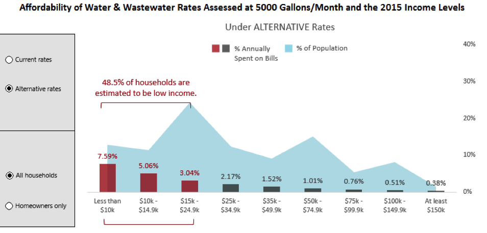
In the old version of the Affordability Assessment above, overlapping bubbles were used to represent a proportion of the population with a certain income bracket. The shape, occlusion, and spacing between these bubbles all work against the brain’s ability to effectively compare them. Therefore, I made over this chart to be a combined area graph and bar chart. The population spread is denoted by the blue shaded area graph, and the overall shape, along with the particular peaks and valleys, give a more instant read on the income spread of the population. Meanwhile, the height of the bars shows you how much people are spending on water and wastewater bills annually as part of their yearly income.
Eliminate distractions
Many of us have grown used to the standard presets that come with software like Microsoft Excel, but that doesn’t mean they are the best design choices. Things like gridlines, tick marks, unnecessary labels, and too many bright, contrasting colors can clutter the visualization and distract from the message. During the Affordability Assessment makeover, I got rid of these extraneous features, simplified the axis labels into bins, and limited the colors to just three. The three bars on the left are red (a color that naturally pops out to the eye, see point #2) to draw attention, as the point of this tool is show how rates affect the most vulnerable customers.
Stay truthful
Avoid misleading the viewer. We’ve all seen charts that misused the power of the ‘instant read’ to make things appear other than they are, whether we realize it or not. This is why it’s important to start your axes from zero, label your units appropriately, and provide axis titles and legends. If you feel that something needs further explanation, explain it! Add a callout or note, as I did below to point out the data on the low-income population.
When in doubt, keep it simple. There are countless ways to visualize data, and many books have been written by masters like Edward Tufte, Stephen Few, and Colin Ware. If you’re interested in the new and improved Affordability Assessment tool, check out how to download it here, or take a look at our other tools.
I hope these tips help you makeover your charts to achieve the best visual impact for your audience. And if you do a chart makeover, send it my way! I’d love to see it.

hello!,I really like your writing so so much! percentage
we keep up a correspondence extra about your post on AOL?
I need an expert on this house to unravel my problem. Maybe that’s
you! Taking a look ahead to look you.