

Bad debt plagues every utility: electric, water, sewer, phone, gas – you name it. A utility can spend thousands of dollars trying to recover the costs of delinquent accounts, and unfortunately, utilities with bad debt meet a costly fate. Bad debts are assumed by the company, and categorized with other necessary expenses; it has become a sacrifice that companies are expected to make. The accumulation of bad debt has become so normal for these companies that estimates are made, dollar amounts are calculated, budgets are finalized, and subsequently, bad debts are forgotten.
Delinquencies and bad debt can be caused by customers who have a harder time paying their bills, whether because of financial constraints or difficulties in communicating with the utility. To improve customer service, utilities can try to identify areas or customers that may need additional assistance or target outreach programs that can help customers communicate with the utility.
Utilities with sophisticated GIS capabilities can map out the customers that are frequently late in paying their bills, for instance. These systems require specialized knowledge and data management skills. However, there is a simple alternative – using nothing but a web browser – that all utilities can use instead of GIS. This method can help utilities identify certain areas within their service boundaries where customers may need additional customer service, based on the demographics of households in those areas. Identifying, for example, which areas in the town have more renters than homeowners, have lower income, or have lower English-language skills, can help utilities understand how to approach and target outreach programs to different groups of customers, based on the locations they live in. While this approach is not perfect (i.e. not every household shares the same characteristics that define the area they live in), it is a good first-cut method to quickly understand the diversity of the customer base by location, and can be achieved in just a few minutes.
Why should a utility map household characteristics by area in the first place? Mapping areas by demographics allows a utility to better identify if affordability issues may exist or why customers are not paying their bills within a specific section of their service area. Mapping areas could help a utility discover that most customers in an area are actually renters in multifamily housing units and may have utilities included in their rent, or that a large percentage of customers in the northeast section of town may need to have communications provided in languages other than English. Spatially locating areas of customers can allow a utility to cater specific outreach or funding programs to these residents, effectively diminish delinquent accounts, and give a utility the opportunity to potentially save hundreds and possibly thousands of dollars.
This can be accomplished by using EPA’s online mapping tool, called EJSCREEN, which contains the latest demographics of geographic areas from the U.S. Census Bureau. Here are instructions on how to create maps identifying areas of customers that may need additional assistance from the utility using EJSCREEN:
- First, determine which demographic you will use to identify areas where you believe additional assistance may be needed and customized outreach approaches targeted. Here are a few demographics provided by the U.S. Census Bureau that may be pertinent:
- Percent of households that are renting (vs. living in owner-occupied homes),
- Percent of households in multifamily housing,
- Percent of households with lower income levels,
- Percent of people living in poverty,
- Percent of households with limited English proficiencies
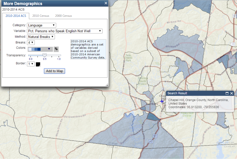
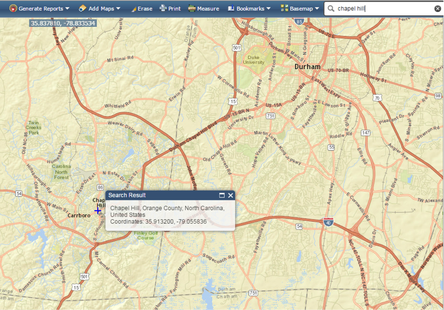
- After selecting the demographic, it’s now time to map! Navigate to EJSCREEN.
- At the top of the webpage, in the search box, enter in the name of your community.
- Click on “Basemap” and select the type of map you would like to view.
- Click on “Add Maps”, then “More Demographics”.
- Select the demographic that you would like to map. Try to focus on mapping percentages rather than absolute count of number of households, which is the default. For example, under the Category “Income/Poverty”, choose to map “Pct. Household Income < 15K” instead of “Households Income < 15K” in the Variable.
- Now select your preferred Method in which your data will be “broken” into categories (quantiles, natural breaks, or equal intervals), as well as the number of Breaks. Select a color palate, transparency measurement, and border thickness.
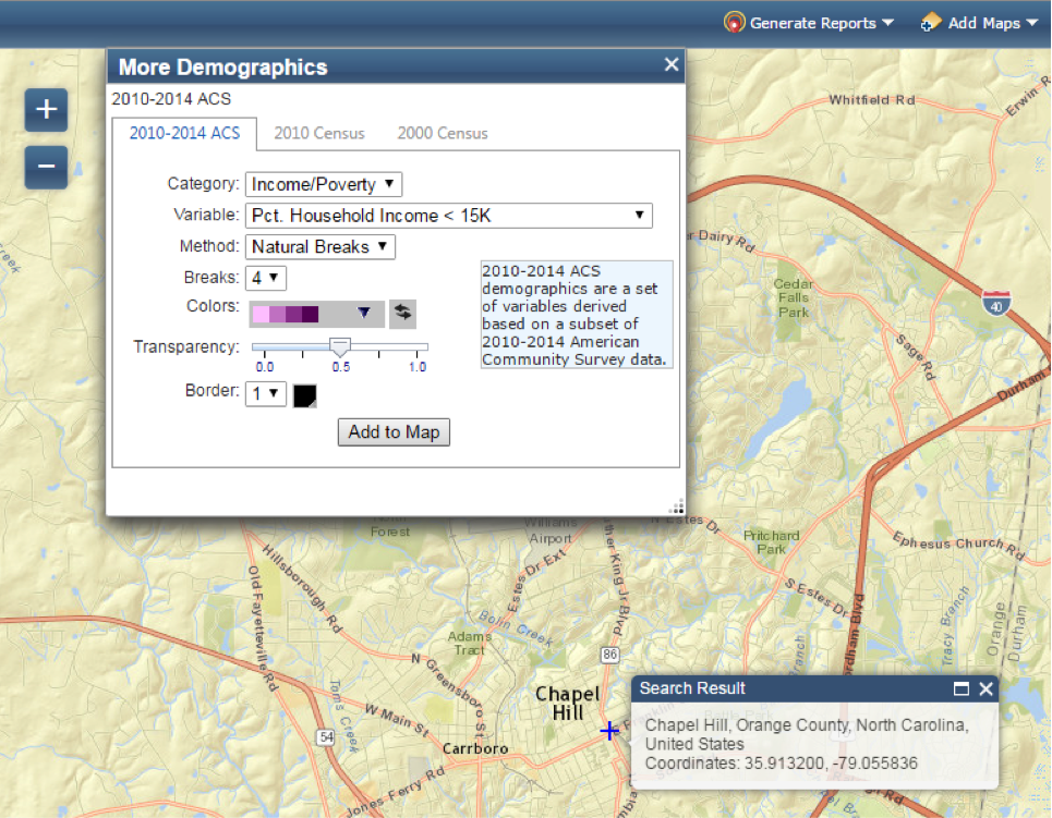
- Click “Add to Map”. Zoom in or out as necessary and adjust the selections above to make your map more legible.
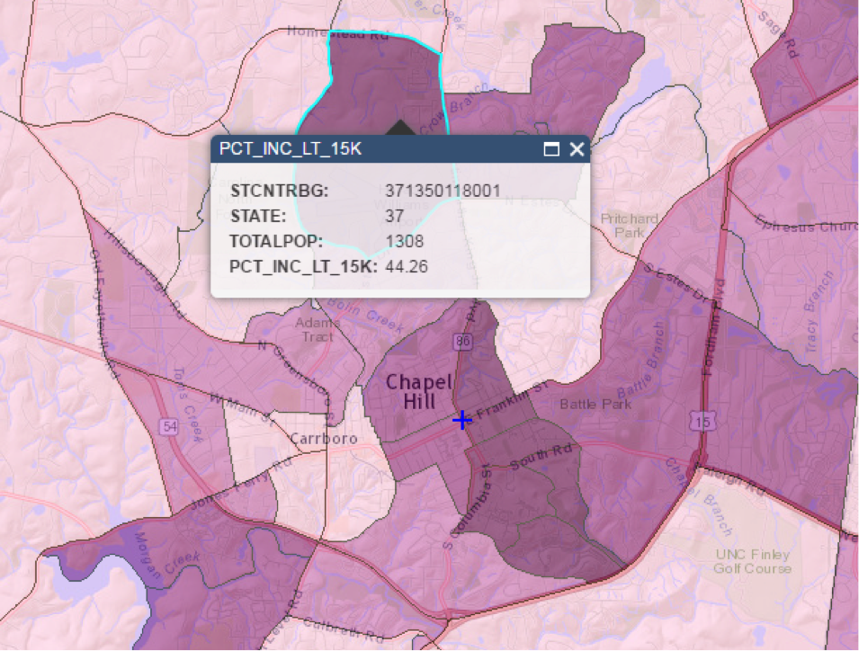
To get a more detailed look at specific demographic values, select “Generate Reports” at the top of the webpage, choose “Click on a Map to Select a Census Block Group” and then click on the location or polygon of interest on the map. This allows you to generate a PDF report on the specified census block group area.
Our team at the EFC provides free direct assistance to water systems serving 10,000 people or fewer. We can create custom maps of your service area and discuss its implications and strategies to work with your water customers. To request free assistance, please click here.
Andrea Kopaskie is an undergraduate student at The University of North Carolina, where she is pursuing a degree in Environmental Science with a concentration in energy and sustainability.
The contents of all posts authored by students are solely the responsibility of the authors. Statements made and opinions expressed are strictly those of the authors and not the Environmental Finance Center or The University of North Carolina at Chapel Hill
Icon made by Freepik from www.flaticon.com

Leave a Reply