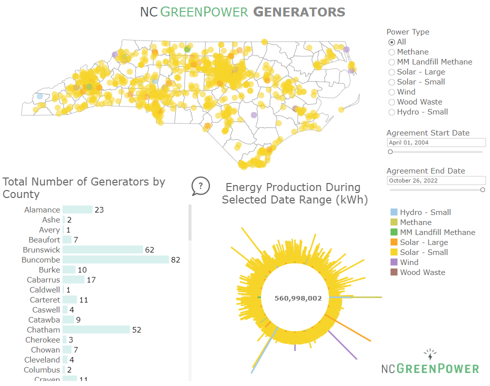
Elizabeth Roknich is a fellow in the 2018 Leaders in Environment and Finance (LEAF) program. She spent summer 2018 at NC GreenPower, a Raleigh-based renewable energy nonprofit. Her work there included financial modeling, cost benefit analyses for program changes, and data visualization work in Tableau, which she used to create two dashboards to highlight their renewable energy generators and their Solar Schools program
Data visualization is a term you might have heard buzzing around lately, gaining popularity and attention across many fields. The idea behind visual representation is not new; people have been explaining data pictorially for centuries, from maps to graphs and on from there. Because of the way the human brain processes information, we are naturally able to understand data in visual formats more easily and quickly than in spreadsheets or reports.
What has really made data visualization boom, however, is the current capacity that computers have to process data at lightning speeds, and the sheer amount of data being collected at any given moment.
Where do we see data visualization?
Visualization is interdisciplinary, cutting across numerous fields. It assists you in everyday decision making, allowing you to grasp difficult concepts or identify new patterns. You can see examples in day-to-day life: any time you use a mapping system to route to a new destination, you are interacting with data visualization that accounts for many factors like road closures, construction, and traffic data. We saw many visualizations predicting and tracking the path of Hurricane Florence, which helped people properly prepare for the impacts of the storm and likely saved lives.
NC GreenPower recently implemented two Tableau dashboards to highlight their renewable energy generators and their Solar Schools program. Tableau is a data visualization software that allows users to interact with visualizations, rather than producing a static image. Check out NCGP’s new dashboards below, and click on them to see the interactive versions:
Data Visualization and Finance
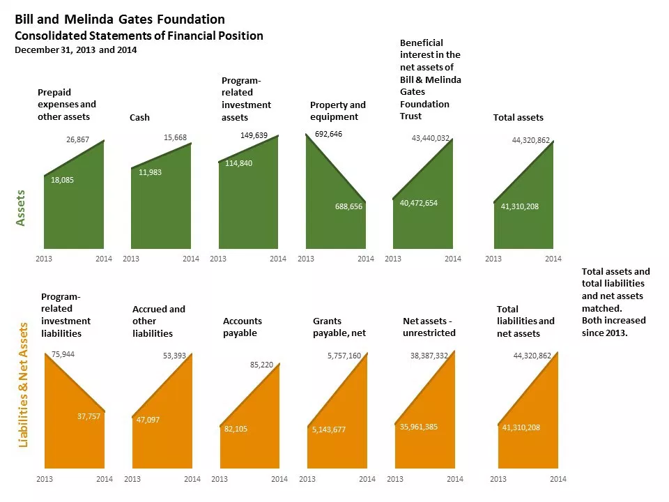
Environmental finance is an area where visualizations are particularly useful, as they help communicate oftentimes dense information to people in ways that make sense. A great example of the power of visualization can be seen in Stephanie Evergreen’s work. As a data “makeover,” Stephanie reimagined the design of a financial report to make it easier to see trends in the data quickly, helping to make the report less intimidating and more easily accessible. See the difference between The Bill and Melinda Gates Foundation financials:

And Stephanie’s version:

The Environmental Finance Center also uses visualization throughout reports, tools, and analyses. The Utility Financial Sustainability and Rates Dashboards are popular examples of visualization tools that assist utility managers and local officials in comparing rate and fee structures and assessing financial health. Similar to the way Stephanie advocates showing financial information visually, the EFC Dashboards make use of dials that clearly and quickly communicate how different indicators rank across comparison groups. In the next few months, we will be rolling out an updated version of the North Carolina Stormwater Dashboard. Check back to see how we continue to use visualization in our mission towards financial sustainability for all.
Elizabeth Roknich is a second year Master’s student at UNC-CH pursuing a degree in Information Science with a focus on Environmental Informatics. She is interested in data visualization as a way to effectively and beautifully convey complex datasets.


Leave a Reply