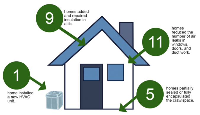
Here at the Environmental Finance Center we work with a lot of data, but all the data in the world is useless if you can’t convey the story of the data to people who need to understand it. In line with our mission to support informed financial decision-making, we produce Utility Financial Sustainability and Rates Dashboards and Excel-based tools to help local governments and stakeholders visually decode complex data. Since I joined the EFC last year as a Data Specialist & Project Manager, I’m happy to say that it is my job to make sure that the visualizations we produce get the message across as efficiently and accurately as possible. Based on my experience I’ve put together some tips on how to give your charts a makeover to give your viewers the biggest impact.
However, you don’t have to be a data nerd to benefit from these makeover guidelines (although, welcome to the club if you are!). Anyone can use the following tips for more effective visualizations, whether you’re presenting at a board meeting or reviewing your own personal budget.