


It’s college football season again, and thoughts among many in the South, and elsewhere, turn to tailgating and touchdowns, hot dogs and sodas, field goals and fun. (Here in Chapel Hill, we like to remember alumnus Andy Griffith’s famous 1953 comical monologue about football, “What It Was, Was Football.”) Meanwhile, those of us at the UNC Environmental Finance Center (EFC) have completed our first-ever Alabama Residential Water and Wastewater Rates Dashboard, which, in fact, ties in with – you guessed it – football! (As well as tying in with the affordability of water and sewer bills by customers in Alabama, of course.)
But before we rush the quarterback and look at the rates dashboard, I also want to share that, thanks to gracious funding from the Alabama Department of Environmental Management (ADEM), we are offering a free series of webinars on rate setting and financial management for Alabama water and sewer utilities in August and September, and there’s still time for you to attend most of them! Upcoming webinars will focus on affordability, rate-setting, and capital planning, and if you’re in Alabama you can earn CEH credits for attending.
The 2014 Alabama Residential Water and Wastewater Rates Dashboard
Returning to the 2014 Alabama Rates Dashboard, this free tool (funded through the Smart Management for Small Water Systems project, a cooperative agreement with the U.S. Environmental Protection Agency) is an online, interactive visual display of each utility’s rates and financial performance indicators for water and sewer. The dashboard is designed to assist utility managers and local officials with analyzing residential water and wastewater rates against multiple characteristics, including utility finances, system characteristics, customer base socioeconomic conditions, and geography.
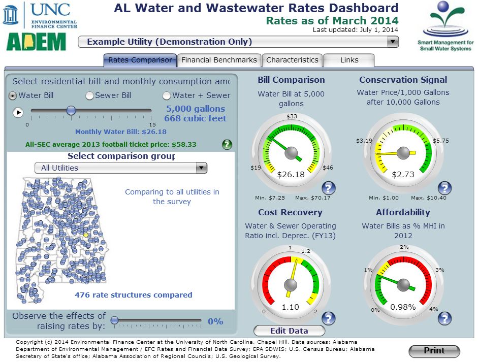
Figure 1. 2014 Alabama Water and Wastewater Rates Dashboard (Residential Rates)
The dashboard allows the user to analyze the rate structures of any of the 451 utilities included for water and or sewer bills, at any amount selected between 0 and 15,000 gallons per month, at 1,000 gallon increments.
What’s the connection with football, you ask?
As you can see on the dashboard (in green, in the upper left), at the request of ADEM, we surveyed the 2013 football ticket prices for all SEC games for all SEC member schools (not just Alabama and Auburn), to arrive at an average ticket price of $58.33. This gives an intuitive comparison point for contrasting, with, say, the combined water and sewer bill at 5,000 gallons per month for a utility customer – such as the $62.25 that would cost a customer of our dashboard’s pre-programmed Example Utility. But what would those bills cost actual customers of, say, communities where some of the great Alabama universities (and sports programs) are located? And how affordable would those bills be for typical or “median” customers in Tuscaloosa (University of Alabama Crimson Tide), Birmingham (University of Alabama at Birmingham Blazers), Auburn (Auburn University Tigers), or Montgomery (Auburn University at Montgomery Warhawks)? Let’s take a look at the following table and see.
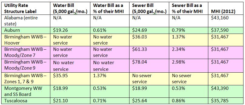
Table 1. Water and Sewer Bills for Four Alabama Cities as a Percentage of MHI.
Using Median Household Income to Measure Affordability
While there are many ways into the conversation about affordability (please see this excellent blog posting by my EFC colleague, Shadi Eskaf, as well as this great post by another EFC colleague, Stacey Berahzer), on the dashboard, we start with median household income, or MHI. (It is “median” in the sense that 50% of the members of the data sample fall below the given number (e.g. $43,150/year for Alabama as a whole), and 50% of the members of the sample are above that number.) We download each year the U.S. Census Bureau’s MHI data, and other socioeconomic data, from the Five-Year American Community Survey (ACS). The results of the ACS are released annually in December, so this year’s Alabama dashboard has an Affordability Dial with MHI data from the 2008-2012 ACS.
We then take a year of water, or sewer, or combined water and sewer bills (depending on the user’s selection on the dashboard) and divide that by the MHI to arrive at the percentages shown above. And while there is no hard and fast rule for where those percentages should lie, it is possible that a typical or “median” customer (when choosing only one service, namely water or sewer) may not face significant affordability issues if their bills fall into the 0% to 1% range (coded green on the dial, and in the table above); they may start to feel some “pain” in the 1% to 1.5% range (coded yellow); and they may be more likely to have difficulties affording their bills above 1.5% of their household income (coded red).
Of course, other elements such as poverty rate (visible on the Characteristics tab of the dashboard for each community), or SNAP (Supplemental Nutrition Assistance Program) participation rate may be useful to look at as well, given the complexity of the affordability question. Or looking at not the entirety of the data sample, but rather at just a segment (e.g. the poorest group) by MHI (or other parameters) may be very useful. Which is, once again, why you should definitely attend our Alabama webinars on August 26 or 28 on the EFC’s new Affordability Assessment Tool!
In addition to looking at the affordability of water and/or sewer rates for the four communities in the table above, what do we see when looking at the entirety of the utilities and rate structures in our 2014 survey we conducted along with ADEM? The three figures below illustrate the distribution of water, sewer, and combined water and sewer bills, respectively, for 5,000 gallons/month (annualized) divided by the annual MHI.
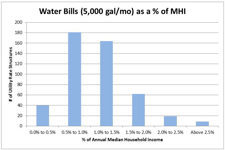
Figure 2. Water Bills at 5,000 Gallons per Month as a Percentage of MHI (n=475).
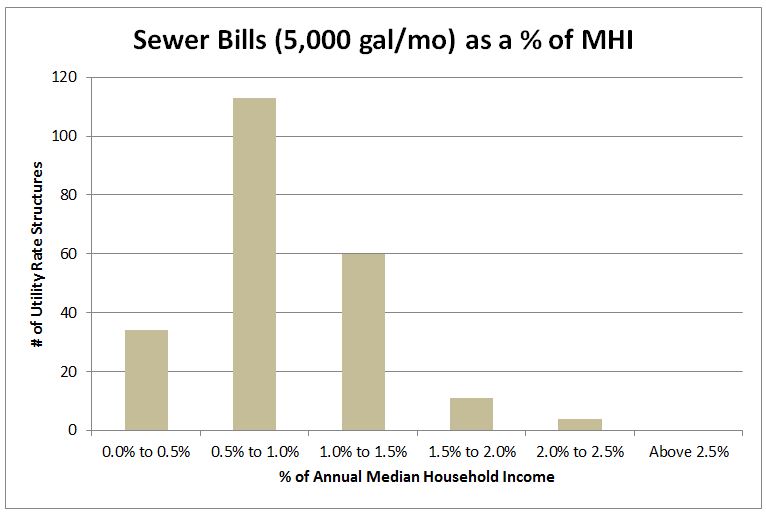
Figure 3. Sewer Bills at 5,000 Gallons per Month as a Percentage of MHI (n=222).
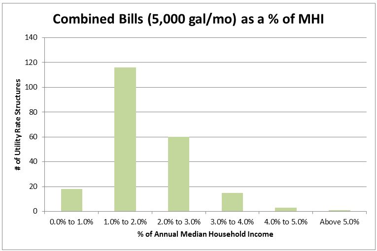
Figure 4. Water and Sewer Bills at 5,000 Gallons per Month as a Percentage of MHI (n=213).
From Figures 2, 3, and 4, we can see that a majority of water customers’ bills at 5,000 gallons per month fall above the 1% of MHI threshold; but at the same time a sizeable majority fall below the 1.5% of MHI level. For sewer bills at 5,000 gallons per month, the clear majority fall below 1.0% of MHI, but a sizeable minority fall between 1.0% and 1.5%. We double these percentages for combined water and sewer bills; but taking that factor into account, the combined bills fall into approximately the same distribution as the sewer bills (influenced by the similarly smaller sample sizes for sewer bills and combined bills). Of course, in all of this, we are looking at the median household income, and not the poorest groups in these communities; and we are looking at 5,000 gallons per month, and not larger (or smaller) amounts of residential water and/or sewer consumption.
So to gain a “first down” or two and learn more about the subject of affordability, come to our Affordability Analysis Tool webinars on August 26 and 28, and check out the other blog post links above. And enjoy the gridiron season this fall!
David Tucker is a Project Director at the Environmental Finance Center at UNC Chapel Hill.

Leave a Reply